Why Neutral Color Palettes Work Best in Luxury Interiors
- virtuserrakaran
- May 6
- 3 min read
Color has a powerful influence on how a home feels. In luxury interior design, color is not simply decorative - it shapes mood, balance, and the overall atmosphere of a space.
While bold trends come and go, neutral palettes continue to remain a defining feature of timeless interiors. From modern homes to classic residences, neutral tones create a sense of calm, sophistication, and flexibility that works across many design styles.
For homeowners planning a refined interior, understanding the role of neutral luxury interior design can help create spaces that feel elegant without becoming overwhelming or outdated.
Why Neutral Colors Remain Popular in Luxury Homes
Neutral palettes have remained popular because they create a balanced and cohesive environment.
Unlike highly saturated colors that can dominate a room, neutral tones provide a softer foundation that allows architecture, materials, and lighting to stand out naturally.
Luxury interiors often use neutrals to create:
A calm and inviting atmosphere
Better flow between spaces
Greater flexibility with décor and furnishings
A timeless overall aesthetic
This approach allows the home to feel refined while still maintaining warmth and comfort.
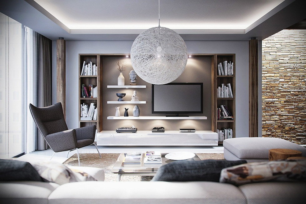
The Difference Between Basic and Layered Neutrals
A successful neutral interior is rarely just one color. Instead, designers layer multiple tones and textures to create depth and visual interest.
Rather than using plain white throughout the home, luxury interiors often combine shades such as:
Warm ivory and cream
Soft taupe and beige
Muted gray tones
Natural earthy hues
This layering creates a richer and more sophisticated environment.
How Natural Light Enhances Neutral Interiors
One reason neutral palettes work especially well in luxury homes is their ability to respond beautifully to natural light.
In homes with large windows and open layouts, neutral colors shift subtly throughout the day depending on lighting conditions.
This creates interiors that feel dynamic and balanced rather than flat or overly stark.
Homes in areas like Boulder and Broomfield often benefit from this effect because abundant natural light enhances softer tones and textures.
Pairing Neutral Colors With Natural Materials
Neutral palettes become even more effective when paired with organic materials.
This combination creates warmth while maintaining a clean and elevated look.
Popular pairings include:
Light oak flooring with warm white walls
Natural stone countertops with soft beige cabinetry
Linen fabrics with textured wood finishes
These combinations help create interiors that feel cohesive and timeless.
Creating Contrast Without Overwhelming the Space
Neutral interiors do not need to feel plain. Contrast is often introduced through carefully selected accents and materials.
This may include:
Dark metal fixtures
Charcoal or black details
Textured fabrics and finishes
Sculptural lighting elements
These subtle contrasts add dimension while preserving the calmness of the overall design.
Why Neutral Interiors Age Better Over Time
One of the biggest advantages of neutral design is longevity.
Trend-driven colors often lose appeal quickly, leading homeowners to redesign spaces more frequently. Neutral palettes provide a more stable design foundation that can evolve gradually over time.
This makes it easier to:
Update furniture and décor
Refresh styling without major renovations
Maintain long-term visual appeal
For luxury homes, this timeless quality is especially important.
Common Mistakes With Neutral Design
Although neutral palettes appear simple, achieving the right balance requires thoughtful planning.
Common mistakes include:
Using only one flat tone throughout the home
Ignoring texture and material variation
Creating spaces that feel too cold or sterile
Overusing bright white without warmth
Successful neutral interiors rely on layering, contrast, and natural materials to create warmth and depth.
How Designers Create Balanced Neutral Interiors
Professional interior designers approach neutral spaces strategically.
Instead of focusing only on paint colors, they consider how all elements interact together,
including:
Flooring and cabinetry
Lighting conditions
Furniture textures
Architectural details
This holistic approach ensures the space feels intentional and visually balanced.
FAQs
Why are neutral colors popular in luxury interior design?
Neutral colors create a timeless, elegant, and cohesive look that works well with many design styles.
Do neutral interiors feel boring?
Not when designed properly. Layered tones, textures, and contrast create depth and visual interest.
What are the best neutral colors for luxury homes?
Warm whites, soft beige tones, taupe, muted grays, and earthy natural colors are commonly used.
Can neutral interiors still feel warm?
Yes. Natural materials and layered textures help create warmth and comfort within neutral spaces.
Are neutral interiors timeless?
Yes. Neutral palettes tend to age better than trend-driven color schemes and remain visually appealing over time.
Conclusion
Neutral color palettes continue to define luxury interior design because they create spaces that feel calm, refined, and timeless. By combining layered tones with natural materials and thoughtful contrast, homeowners can achieve interiors that remain elegant for years to come.
Rather than relying on bold trends, neutral interiors focus on balance, texture, and long-term appeal. When executed thoughtfully, they provide a sophisticated foundation that supports both modern and classic design styles.


Comments